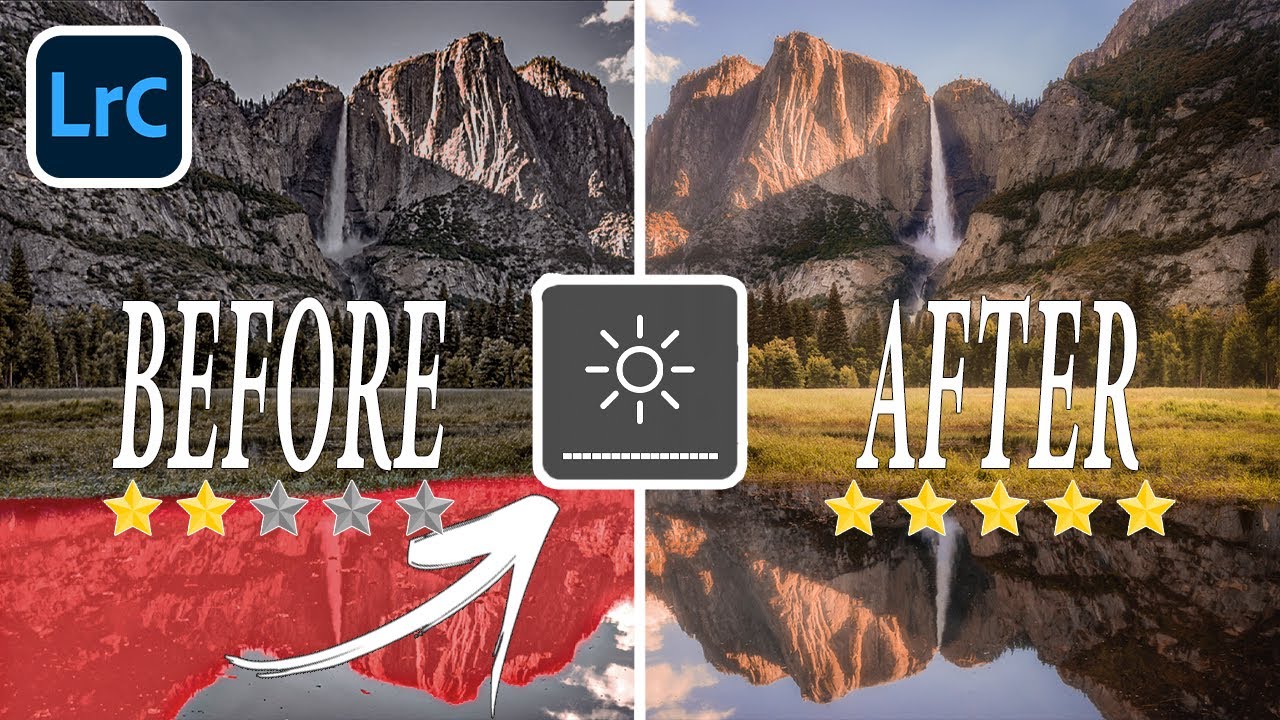
There’s a particular kind of frustration that comes from spending an hour editing a photo, exporting it, and then looking at it on your phone and thinking, “That looks nothing like what I saw on my screen.” I’ve been there more times than I’d like to admit. For a long time I assumed it was a skill gap, that I just needed more practice. Turns out, some of it wasn’t about skill at all. It was about the environment and habits I’d built around editing, habits that were quietly sabotaging every image before I even touched a slider.
In this Mark Denney tutorial, Watch the full tutorial on YouTube, he pulls from 82 one-on-one private coaching sessions he’s completed over three years to identify the editing mistakes he saw most often. These aren’t obscure edge cases. They’re patterns, the same problems showing up again and again across photographers at different skill levels. What I appreciate most is that several of these mistakes aren’t about bad technique. They’re about working against yourself without realizing it.
Here’s a walkthrough of what he covers, reframed around how you can actually apply each correction in your own editing process.
Step 1: Check Your Monitor Brightness Before You Edit Anything
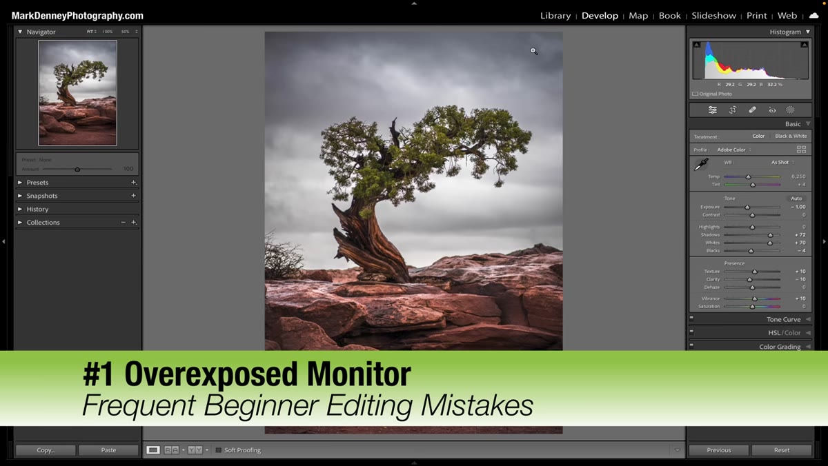 Monitor brightness being adjusted lower to reveal dark image
This one is uncomfortable to hear because it’s so simple, and yet it changes everything. If your monitor is cranked up to full brightness, your images will look more exposed than they actually are. You’ll think a photo is well-lit, export it, and then see it looking muddy or dark on any other screen. Mark calls this the “overexposed monitor” problem, and it’s not really about editing skill at all. It’s about your hardware working against you.
Monitor brightness being adjusted lower to reveal dark image
This one is uncomfortable to hear because it’s so simple, and yet it changes everything. If your monitor is cranked up to full brightness, your images will look more exposed than they actually are. You’ll think a photo is well-lit, export it, and then see it looking muddy or dark on any other screen. Mark calls this the “overexposed monitor” problem, and it’s not really about editing skill at all. It’s about your hardware working against you.
A good starting point is setting your monitor brightness to around 50 percent, then adjusting slightly based on the ambient light in the room you’re editing in. If you’re in a bright sunlit space, you may need to go a little higher. The key check is your histogram. If the histogram tells you the exposure is balanced but the image looks bright on your screen, your monitor is lying to you. Learn to trust the histogram over your eyes, especially before you’ve calibrated anything.
Step 2: Stop Pulling Down the Highlights Slider Globally
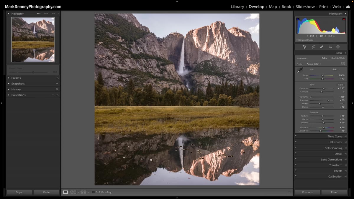
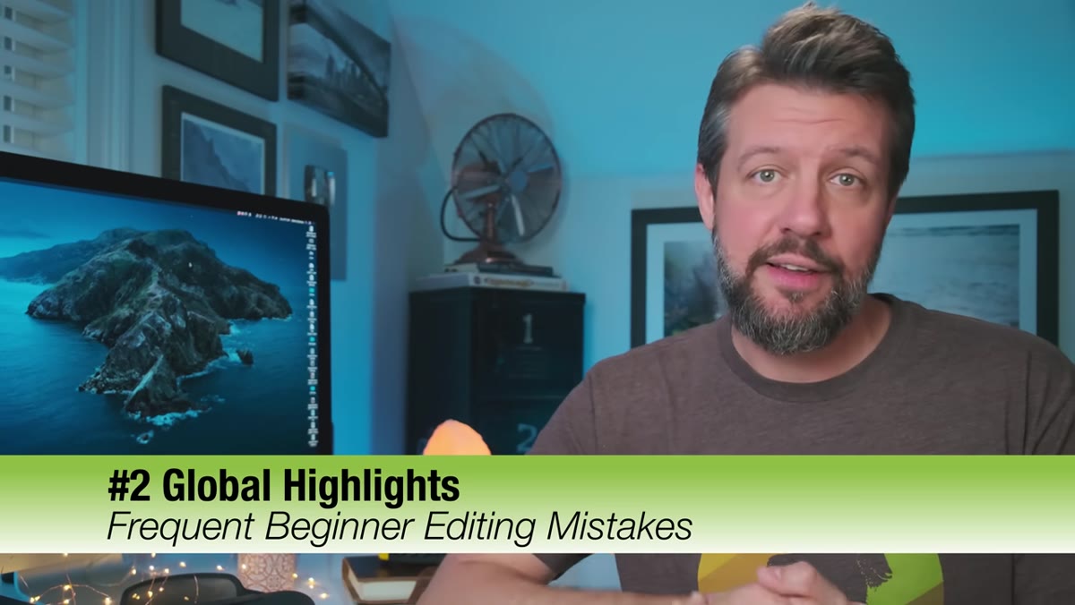 Global highlights slider being dragged left in editing panel
This is the one that made me wince a little, because I did this constantly in my first two years of editing. You bring in a landscape or a portrait, the sky looks a bit blown out, and your first instinct is to drag the Highlights slider hard to the left. The sky recovers, great. But everything else in the image, your subject, the midtones, the foreground, it all gets flattened and dulled along with it.
Global highlights slider being dragged left in editing panel
This is the one that made me wince a little, because I did this constantly in my first two years of editing. You bring in a landscape or a portrait, the sky looks a bit blown out, and your first instinct is to drag the Highlights slider hard to the left. The sky recovers, great. But everything else in the image, your subject, the midtones, the foreground, it all gets flattened and dulled along with it.
The fix is to stop treating the Highlights slider as a sky recovery tool and start using local adjustments instead. In Lightroom, use a gradient mask over the sky, or use the Select Sky feature if you’re on a recent version. That way you’re pulling down the highlights only where it actually needs to happen, not across the entire frame. Your subjects will thank you.
Step 3: Don’t Overcook the Clarity and Texture Sliders
 Clarity slider pushed aggressively showing over-textured image
Clarity and Texture are genuinely useful tools, but they have a ceiling, and beginners tend to find that ceiling fast by crashing through it. Adding Clarity brings out midtone contrast and makes images feel sharp and punchy. But push it too far and skin looks like tree bark, water looks crunchy, and the whole photo starts to feel like an HDR image from 2009.
Clarity slider pushed aggressively showing over-textured image
Clarity and Texture are genuinely useful tools, but they have a ceiling, and beginners tend to find that ceiling fast by crashing through it. Adding Clarity brings out midtone contrast and makes images feel sharp and punchy. But push it too far and skin looks like tree bark, water looks crunchy, and the whole photo starts to feel like an HDR image from 2009.
A conservative approach: use Clarity in the plus 10 to plus 20 range as a starting point for landscapes, and be even more restrained on portraits. Texture is subtler and often safer, but it still benefits from a light hand. The test is to toggle the adjustment on and off. If you can immediately see the difference when it’s removed, you’ve probably gone too far.
Step 4: Match Your Color Grading to the Mood, Not Just Your Preferences
 HSL panel with individual color channels being adjusted
Color grading is where a lot of photographers start chasing a look rather than serving the image in front of them. You fall in love with a moody teal-and-orange grade after seeing it on someone else’s feed, and suddenly every photo you take gets pushed in that direction regardless of whether the scene calls for it.
HSL panel with individual color channels being adjusted
Color grading is where a lot of photographers start chasing a look rather than serving the image in front of them. You fall in love with a moody teal-and-orange grade after seeing it on someone else’s feed, and suddenly every photo you take gets pushed in that direction regardless of whether the scene calls for it.
The more useful approach is to ask what the light was actually doing when you took the shot, and grade toward that. A golden hour landscape probably wants warm shadows and lifted highlights. A foggy morning might benefit from cooler, desaturated tones. Use the HSL panel to target specific colors rather than applying a blanket color grade across the whole image. Grading is most powerful when it feels inevitable, like it was always supposed to look this way.
Step 5: Review Your Work at Different Zoom Levels Before You Export
 Image toggling between 1:1 zoom view and fit-to-screen view
One of the quieter mistakes Mark flagged is editing almost entirely at one zoom level, usually zoomed in, and then exporting without ever stepping back to see the full image. When you’re zoomed in checking sharpness or noise, you lose the sense of the overall composition and tonal balance. When you finally zoom out or look at the exported file, things feel off but you can’t pinpoint why.
Image toggling between 1:1 zoom view and fit-to-screen view
One of the quieter mistakes Mark flagged is editing almost entirely at one zoom level, usually zoomed in, and then exporting without ever stepping back to see the full image. When you’re zoomed in checking sharpness or noise, you lose the sense of the overall composition and tonal balance. When you finally zoom out or look at the exported file, things feel off but you can’t pinpoint why.
Build a habit of doing a final review pass at three zoom levels: fit to screen to judge composition and overall exposure, 50 percent to catch any local adjustment edge issues, and 100 percent to check sharpness and noise. It takes about 90 seconds and catches a surprising number of problems before they make it into your export folder.
One Thing I’d Add From My Own Experience
The thread running through all five of these mistakes is the same thing: editing on autopilot. When you’re working quickly, especially on a big batch after a shoot, it’s easy to apply the same moves to every image without actually looking at what each one needs. I started keeping a simple checklist next to my monitor, basically a short list of questions to answer before I export. Is my monitor calibrated? Did I use any global adjustments that should be local? Does the color grade match what this scene was actually doing?
It sounds basic, but having something physical to glance at interrupts the autopilot mode. Your editing gets slower at first and then faster, because you stop having to redo things.
The single most important takeaway here is this: most editing problems aren’t software problems. They’re workflow and environment problems. Fix those first, and the software becomes a lot easier to use well.
Watch the full tutorial on YouTube to see Mark walk through each of these with real before-and-after examples from his coaching sessions. Seeing the actual images side by side is worth the time.
Comments (3)
Tried this technique this morning. Game changer for real.
Printing this out and pinning it next to my monitor. That good.
This is fantastic. I've been recommending this approach to my readers too.
Leave a Comment